Creating Effective Landing Pages
03-03-2017

Your landing page is the secret to securing more targeted visitors. If you want more targeted leads and higher conversion rates, then optimising your landing pages is absolutely necessary.
We have a proven system that works for thousands of our Affiliates, and we want to share it with you! These designs were built with the convincing power to convert leads for you while you work on other marketing tasks. Your business requires your full attention, so the more self-sufficient your landing pages are, the more time you will have to focus on building the rest of your platform.
Follow these simple steps to immediately improve your landing pages and generate more conversions!
Tips for Affiliates: Empathise with Your Audience
It’s not easy to empathise with your customers when you’re overwhelmed by your own personal goals and agendas. However, the success of working hard will only come when you decide to think differently. The most appreciated and propagated content/products/services are the ones that go above and beyond for their customers. If you’re in the position of providing value, then your job is comparable to that of a doctor’s. You have to first think in your patients’ shoes. You might even have to do a little surveying and researching to see what’s ailing them. In the same way, find out what your audience needs and why they have come to that point. Then, you will be able to create relevant and relatable content that will pull in more appreciative customers.
Tips for Affiliates: Use the Funnel Design
There is only one purpose for your landing page, and that is to get people to sign up for whatever you have to offer. If your landing page is packed with so much content that the average visitor wouldn’t know where to click on next, then that’s going to be an issue. Clear and concise call-to-actions are essential to your conversion rates. The best landing pages have clear directions for the visitor to follow. These directions can either be clearly stated or just incorporated into the design of the page.
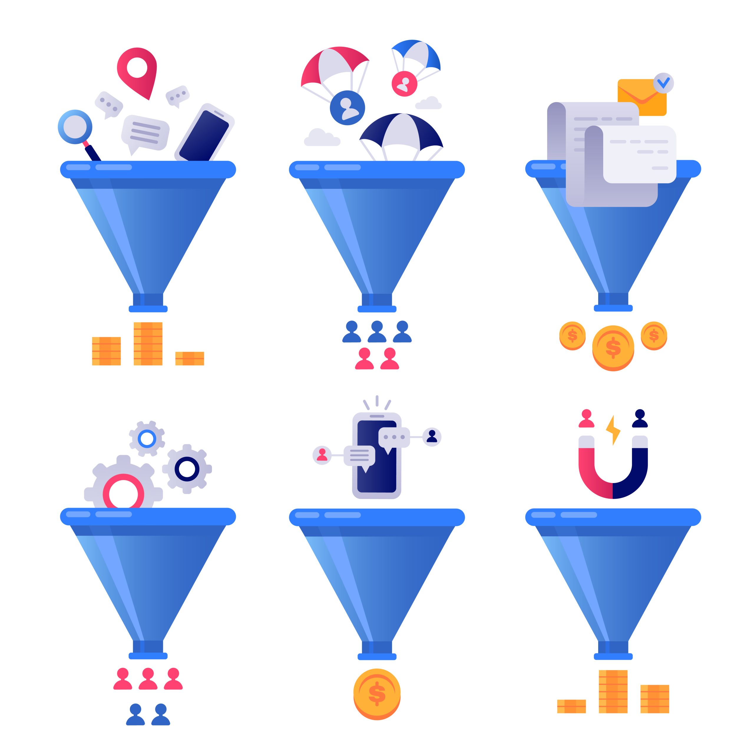
The Funnel Design is the standard way of organising content for higher ROI. Funnels generally begin with eye-catching content that convinces the reader to keep scrolling, such as an image of a person looking downwards or nurturing text that says, “Take a look at our options below!”
Funnels don’t always have to be in this standard design. Your layout can drive visitors both horizontally and vertically, as long as the directions are clear. A great way to test this is to run it by a third party. Are they able to follow your directions, or are they lost in your design? Does your main call-to-action stand out or is it overshadowed by something else? By asking these questions, you’ll have a better idea of what to fix.
Tips for Affiliates: Gated Content
Don’t be afraid to use gated content to boost your visitors’ interest and level of investment on your page. Naturally, most landing pages have gated content because they encourage sign-ups of some kind. Assuming that yours is the same, then all of your page content must contribute to convincing the audience of this incredible offer. Indeed, everything on the page must be geared to getting the audience to sign up, which means that your other minor call-to-actions must be heavily minimised or eliminated completely. The gated content is the reward at the bottom of the funnel.
Tips for Affiliates: Captivate Visitors with Your Titles
News sites such as BuzzFeed and UpWorthy have mastered the art of crafting emotionally-appealing titles. They can take a news story and make it viral because of their remarkably engaging headlines. The funny thing is that these headlines don’t include any fancy words or overly deep insights, either. They seem to be as conversational as ever—most of the time, even informal. What’s the secret, you might ask?
The secret to their headline success is because they have done research on their target audience. They know how their target audience speaks. Knowing the language of your audience is crucial to the success of your buzz-worthy articles. Visitors will be much more inclined to click on a title if it does four things:
- Highlights the benefit of viewing the content
- Speaks in a familiar tone of voice
- Is emotionally-charged
- Creates an urgency
- If your title has all of these attributes, then chances are, you will start seeing a lot more clicks on your content than before!
Tips for Affiliates: Include Relevant Images
Relevant images play a huge part in the success of your landing page. Images should do the following:
- Provide more insight
- Guide the visitor
- Create an urgency
- Complement the theme and design
- Contributes to the main call-to-action but doesn’t take away from it
Before you think of adding an image to fill the gap on your landing page, test it against these five rules of thumb. If the image adds value to the site, contributes to the theme and design, creates an urgency, directs the visitor, and doesn’t distract from the main call-to-action, that picture belongs on the landing page. If not, it’s time to toss it out and look for a better one! Images are absolutely necessary for captivating the audience because we are a visually-stimulated species. The right images will convey emotions that could even empathise with your audience. Needless to say, if you’re looking for a way to upgrade your landing page, a great place to start would be the images.
If you haven’t registered with us yet, sign up now and join our network of Affiliates.


